Here are some websites I made for clients...
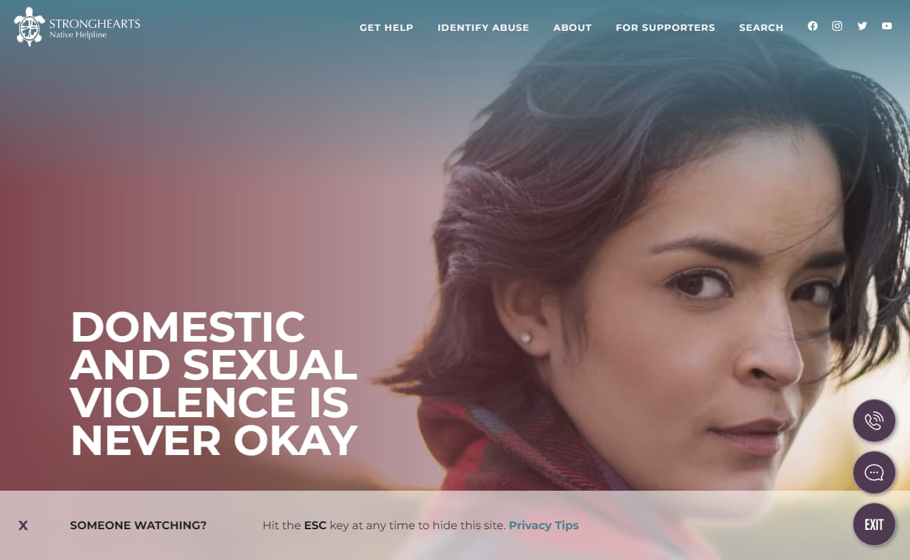
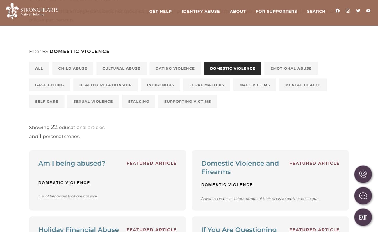
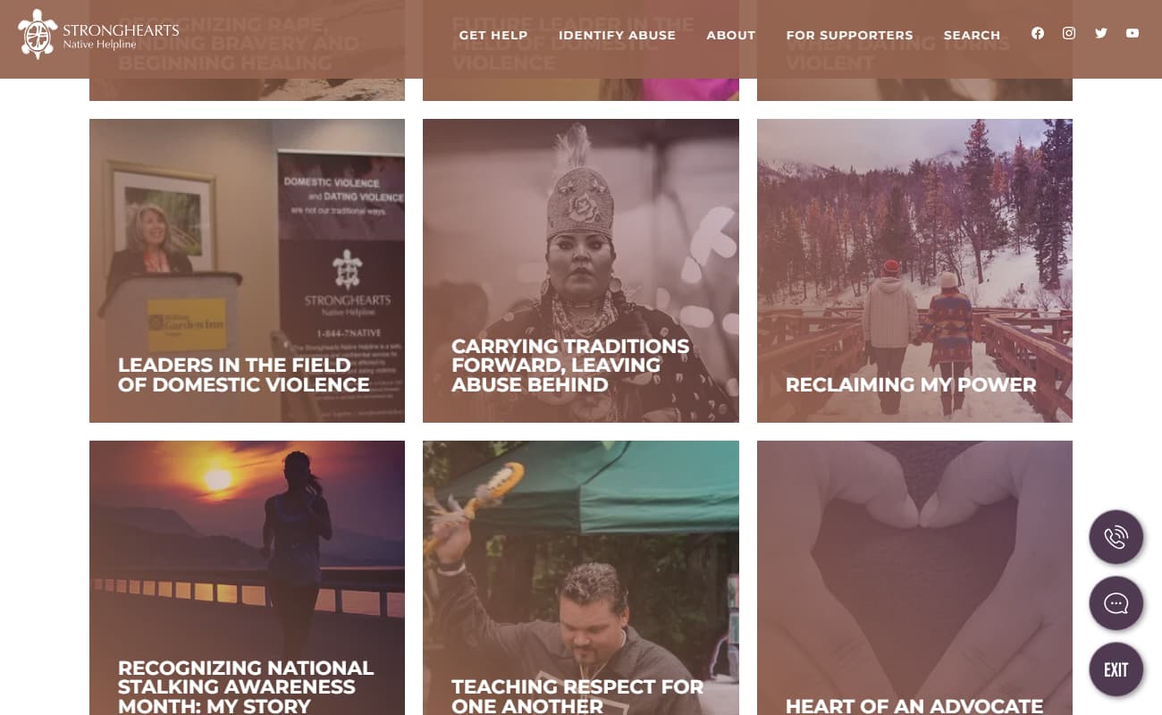
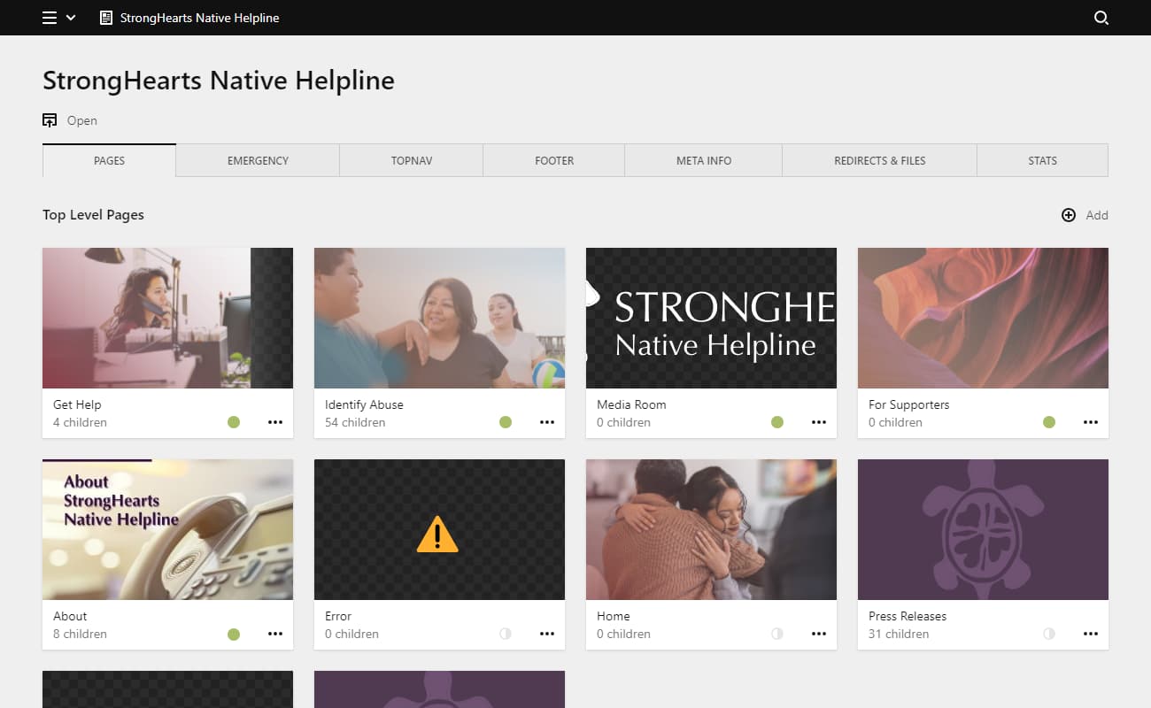
The StrongHearts organization had a very distinct need to provide resources for people trapped in situations of domestic violence.
They needed a site which would provide fast and reliable help to those in need, while also being discreet and respectful of the privacy and situations of its vistors.
This website was built thoughtfully for growth and measurability, while avoiding all Big Data solutons.
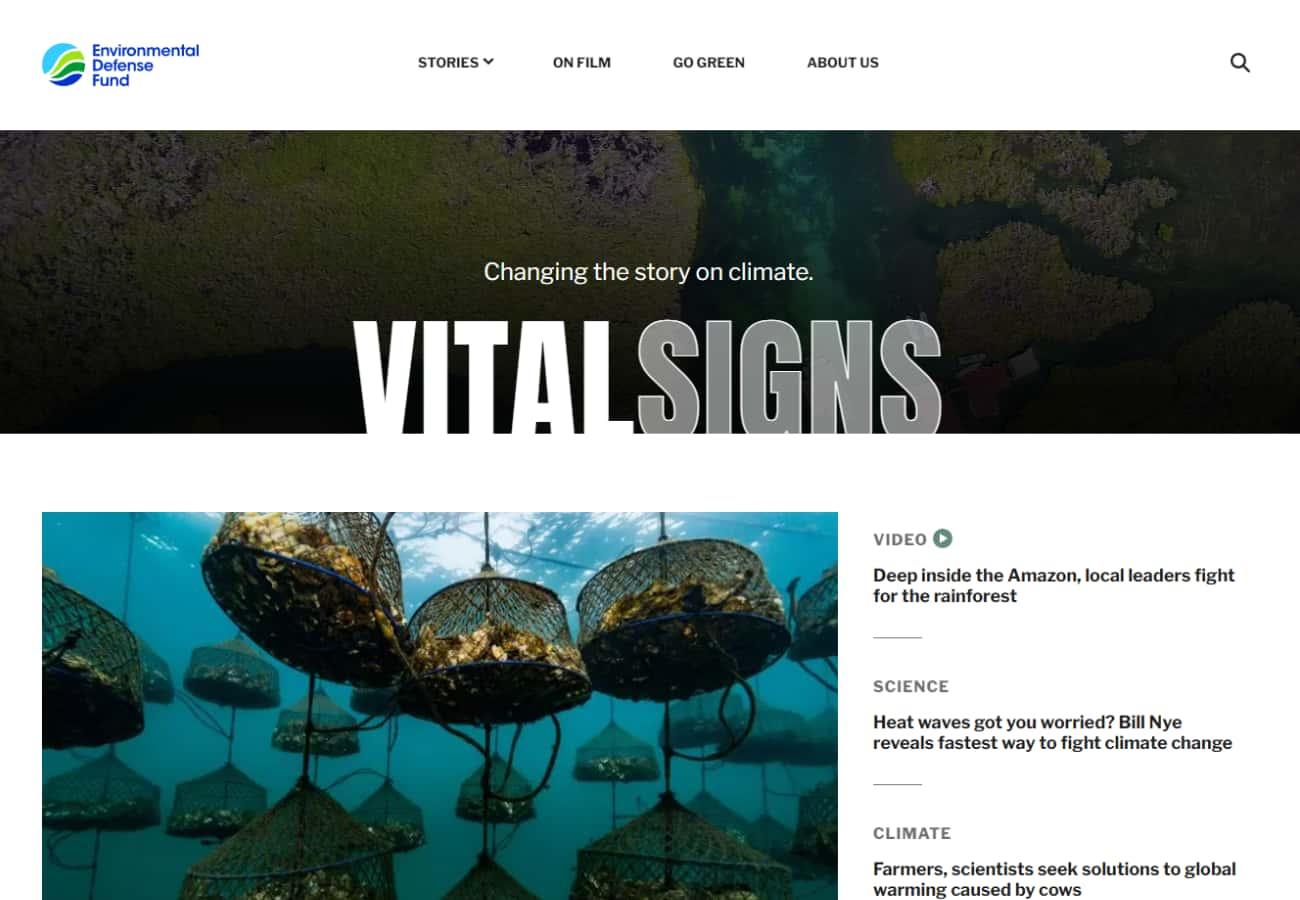
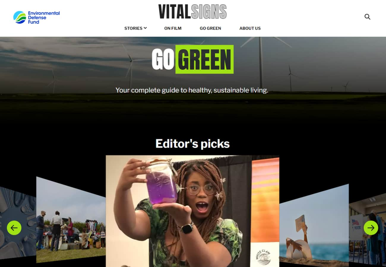

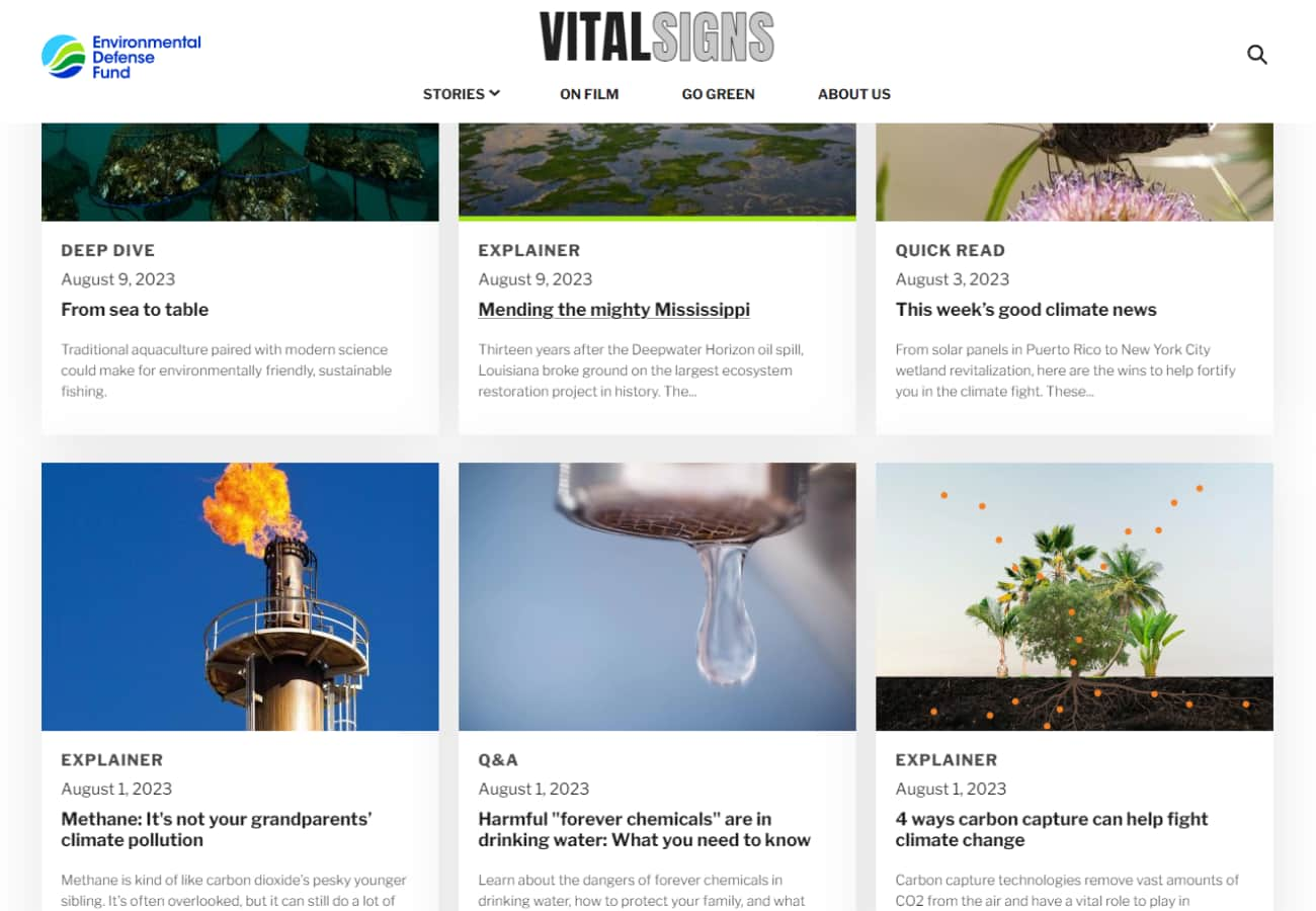
The Environmental Defense Fund does everything they can to deliver solutions for the pressing ecological problems facing us all, and as part of that mission, they needed a place to let the world know the latest climate news.
This site was created to be engaging multimedia, as varied and interesting as the Earth we're trying to protect.
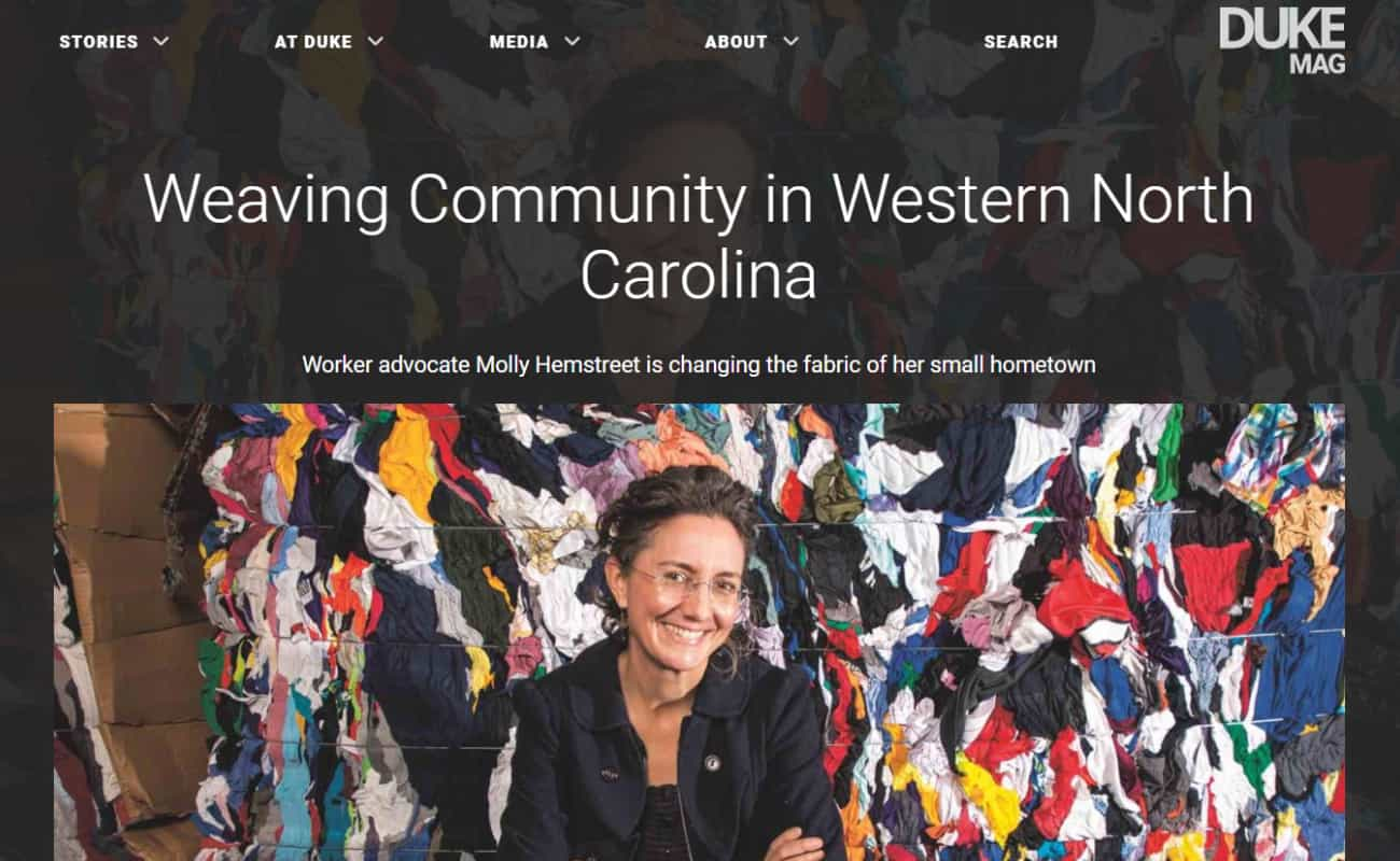
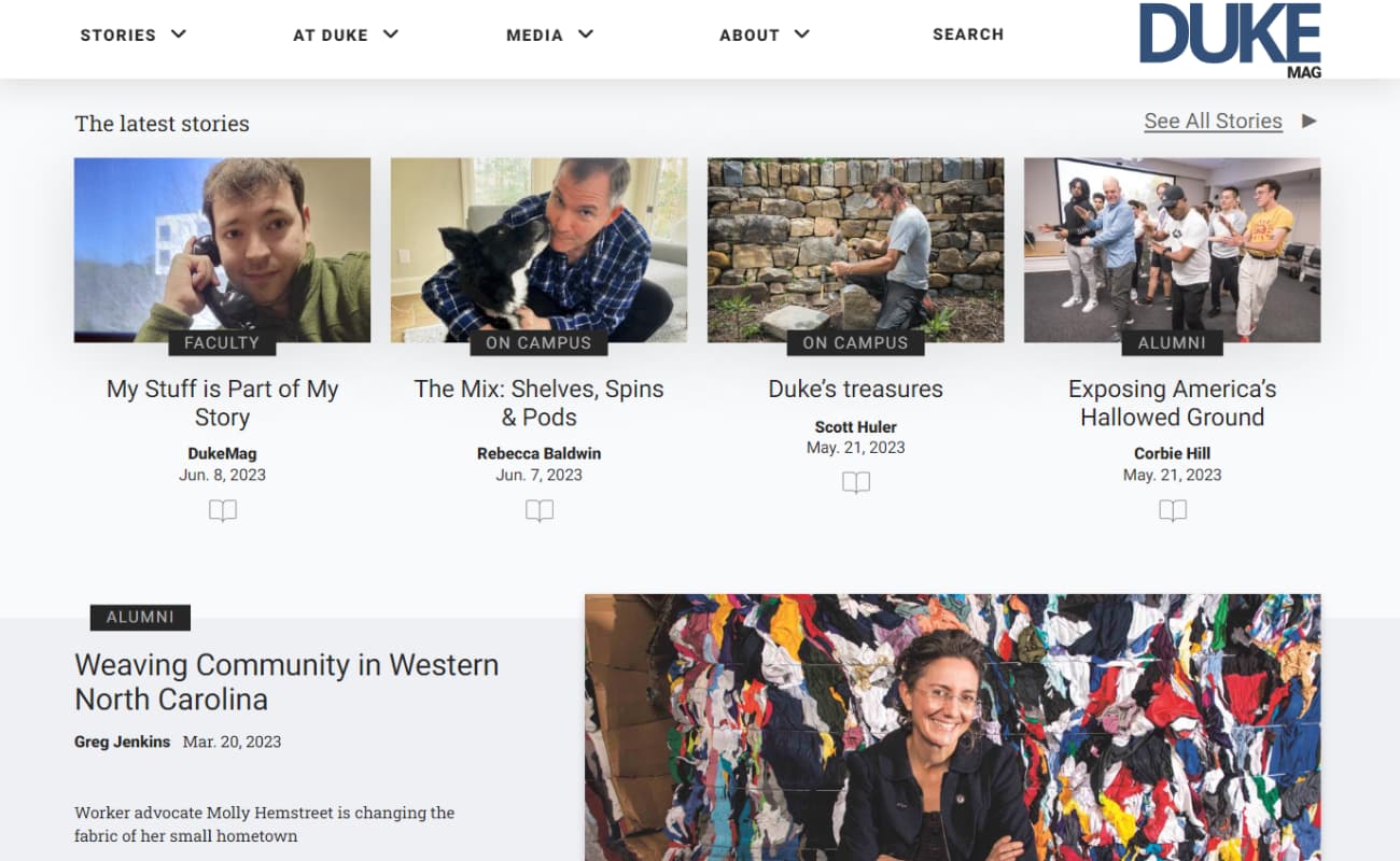
Duke University had an outdated concept of an online magazine. What was once a visually indistinct dumping ground for copy/pasted material from their print magazine became a vibrant space for online-first multimedia content.
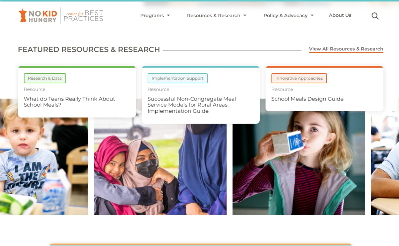
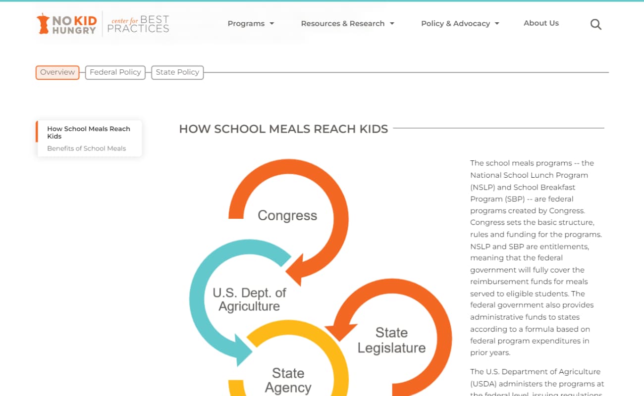
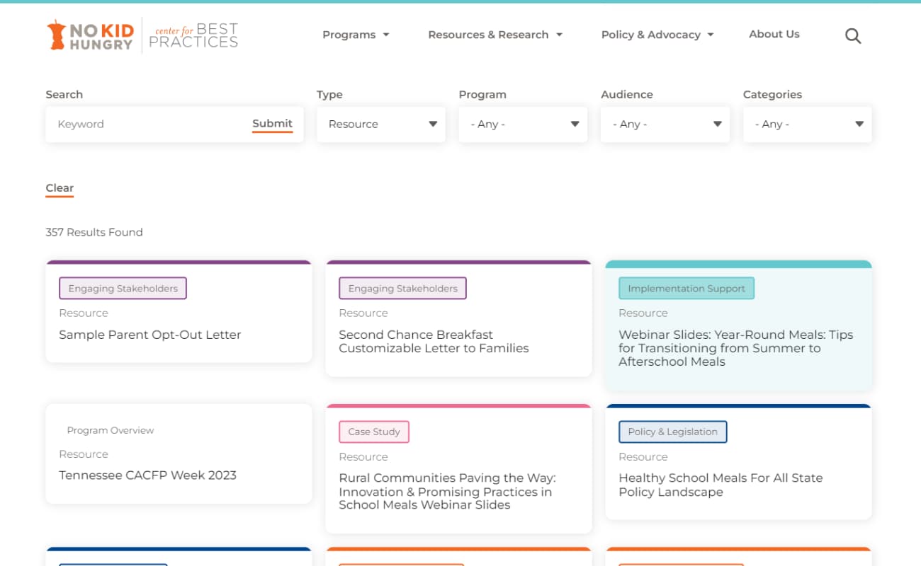
Child Hunger is an extremely important issue that needs a multipronged approach.
As one of those prongs, the No Kid Hungry Center For Best Practices is a collection of hundreds of different resources for educators, government officials, nonprofits and parents, collected and displayed responsibly and consistently.
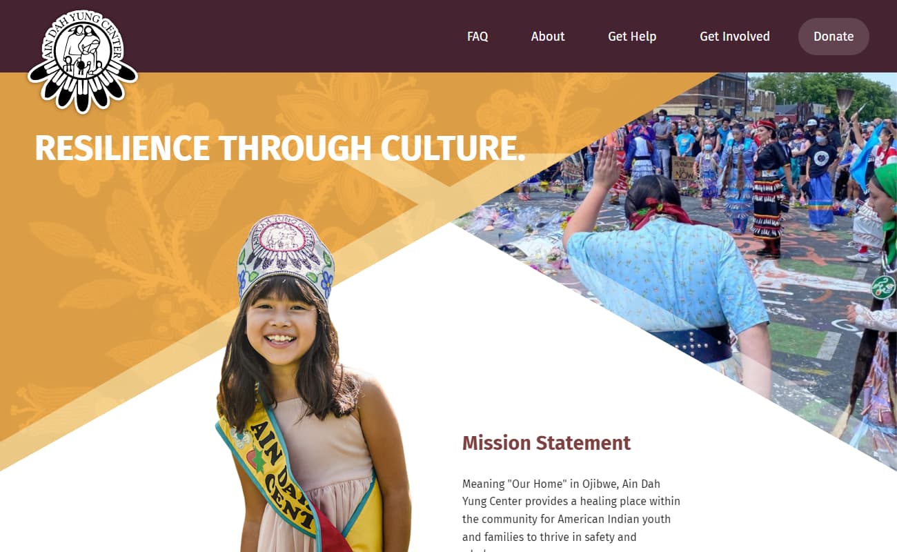
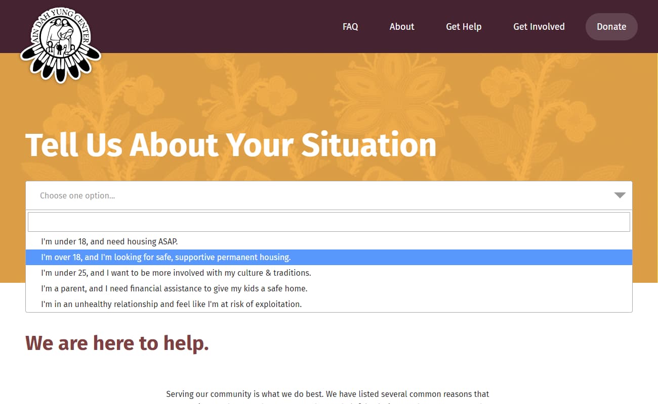
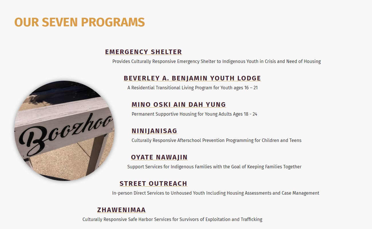
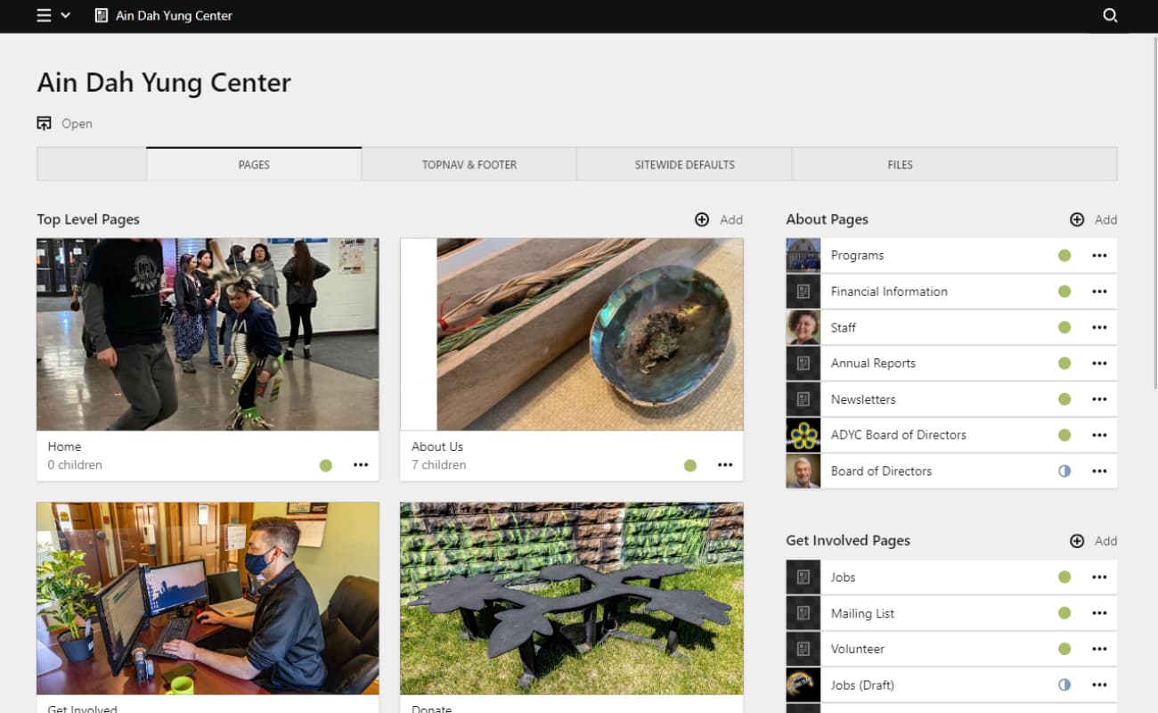
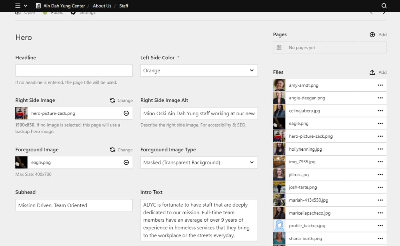
As a culturally responsive crisis center for native youth, the Ain Dah Yung Center provides seven different programs for members of the community.
The purpose of this website is to showcase the good work done by the organization so as to encourage donations, but also to provide a directory of service options to those in need.
Technologies used...
- Kirby
- PHP
- Sass
- YAML
- AOS.js
- JavaScript
- Matomo
- Drupal
- Twig
- Vimeo Developer API
- Platform.sh
- Gutenberg
- JSON API
- Azure
- JWPlayer
- Vue
- Pug
- jQuery
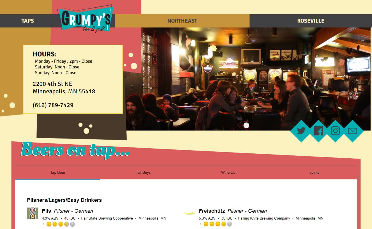
- Untappd
- .NET
- Lottie
- ScrollMagic
- Howler.js
- Craft
- Concrete5
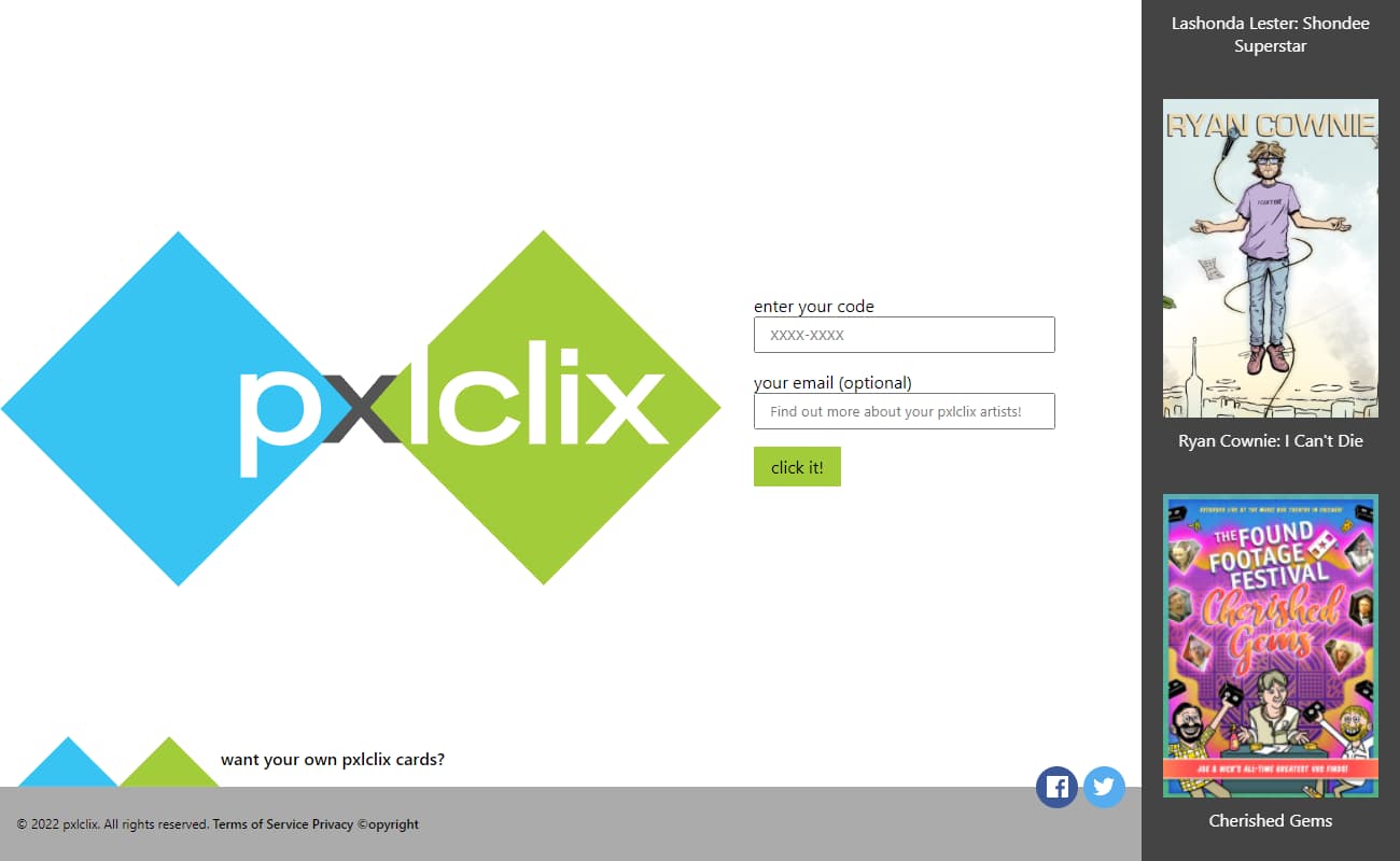
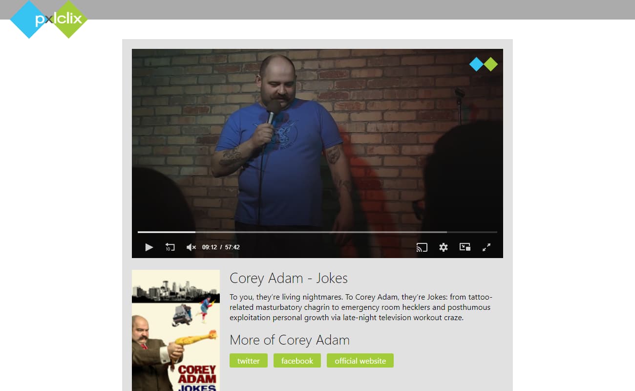
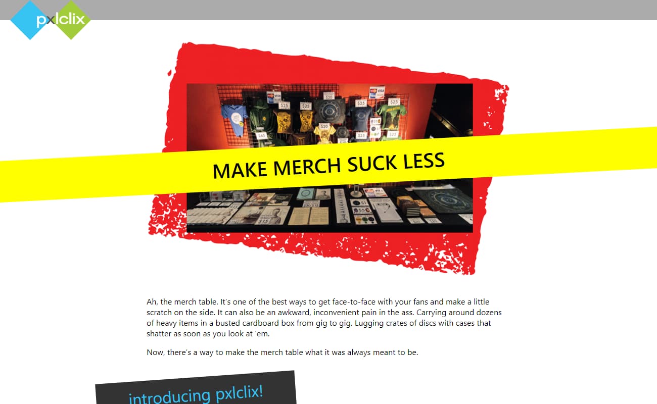
A simple problem exposes a some real logistical and technical challenges: Independent entertainers (comedians, bands, film groups) have to tour with their own merch, or pay an insane cut to someone else.
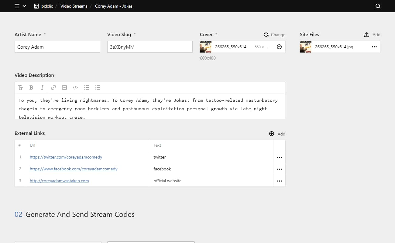
The purpose of pxlclix is to simplify the Merch Stand: Sell a card. The card has a code, and the code gets you streaming video.
The site checks against a database of generated codes and matches which cards have been used, and when.
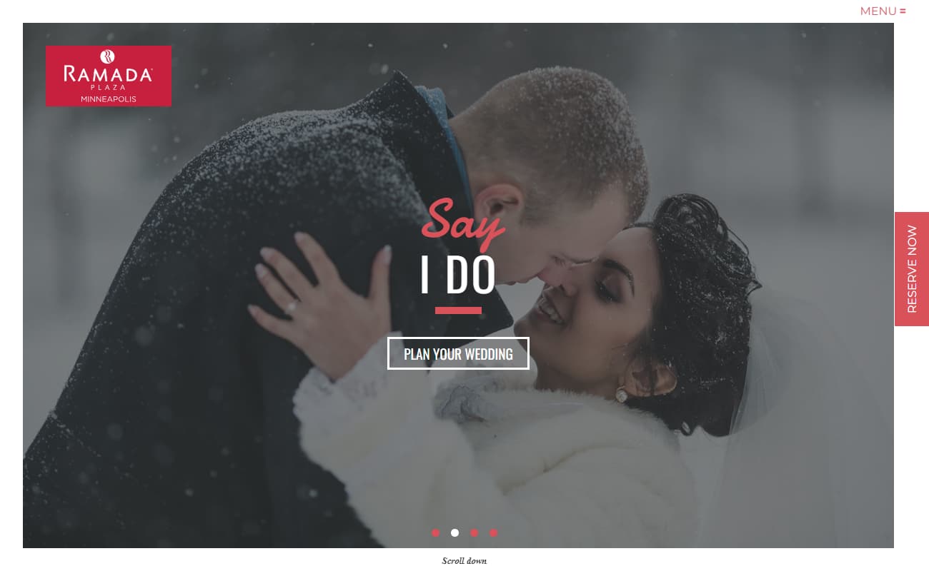
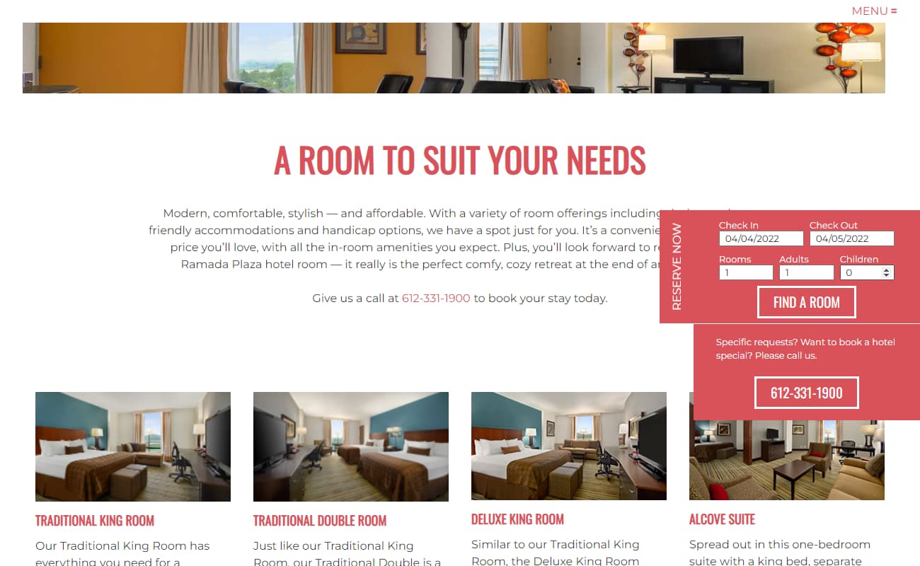
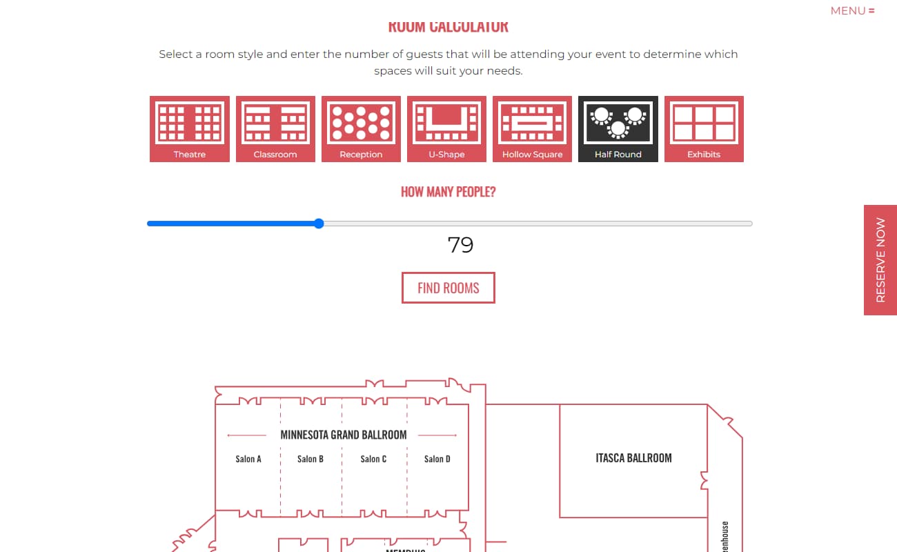
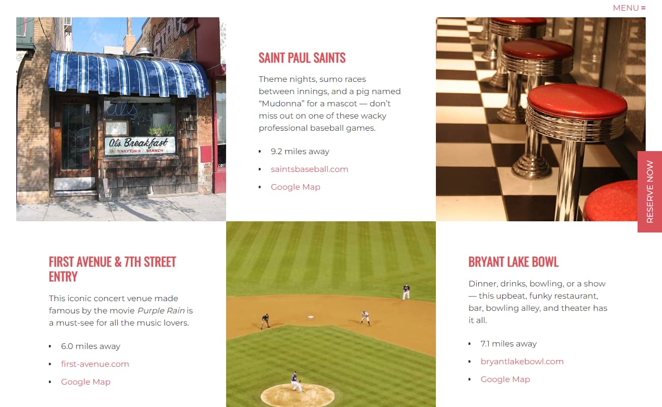
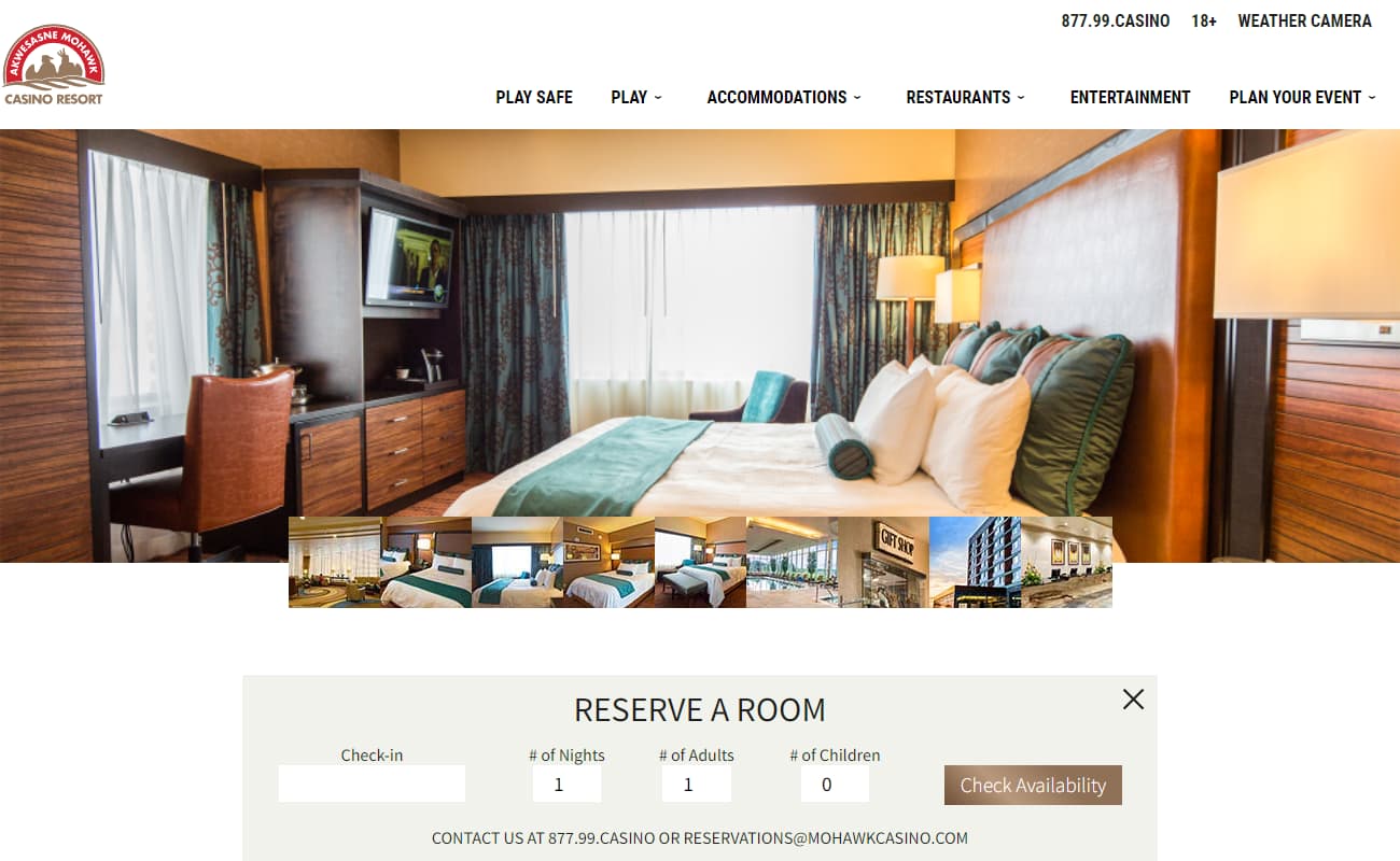
As a franchisee, the Ramada in Minneapolis was running into a problem: The web support they were receiving from corporate was slow and underwhelming. They wanted a web experience that lived up to their brand.
This website was created specifically for them, with an eye on event hosting as well as room rental, and bragged about their newly purchased amenities.


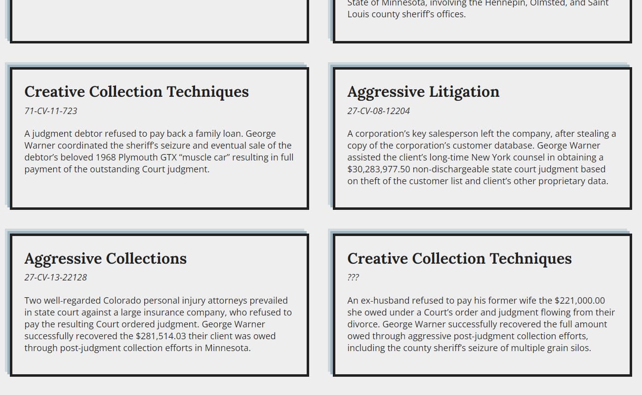
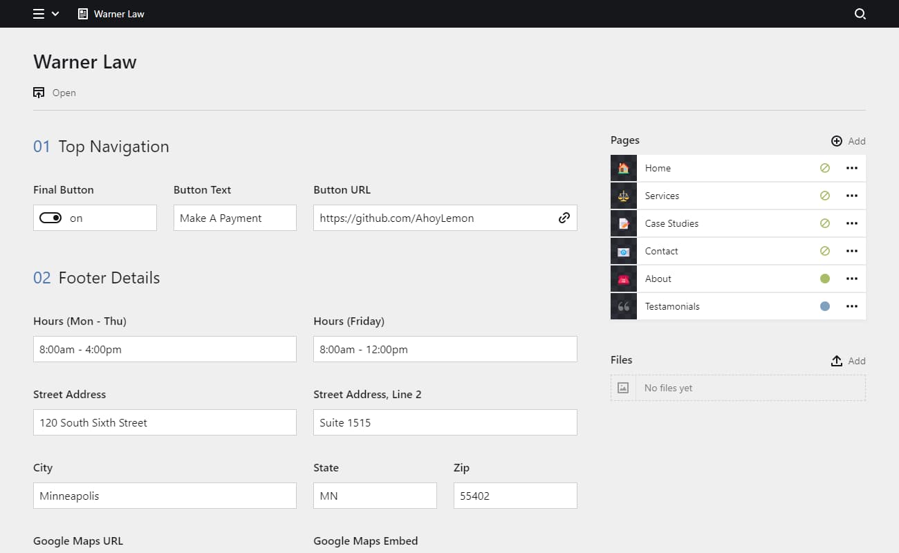
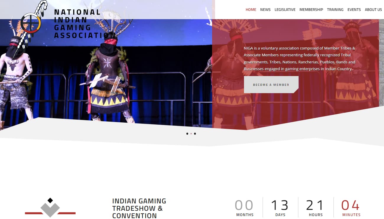
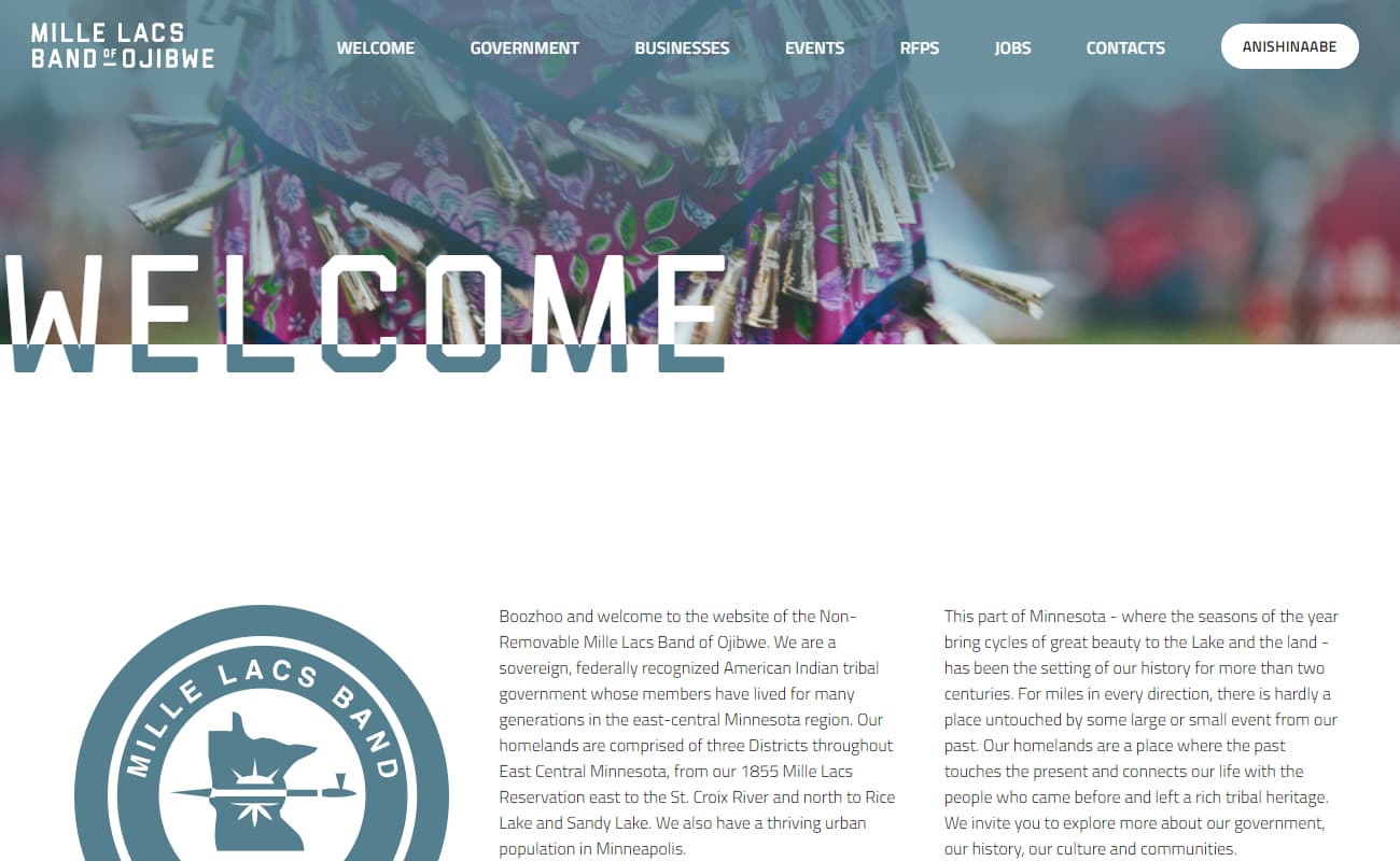
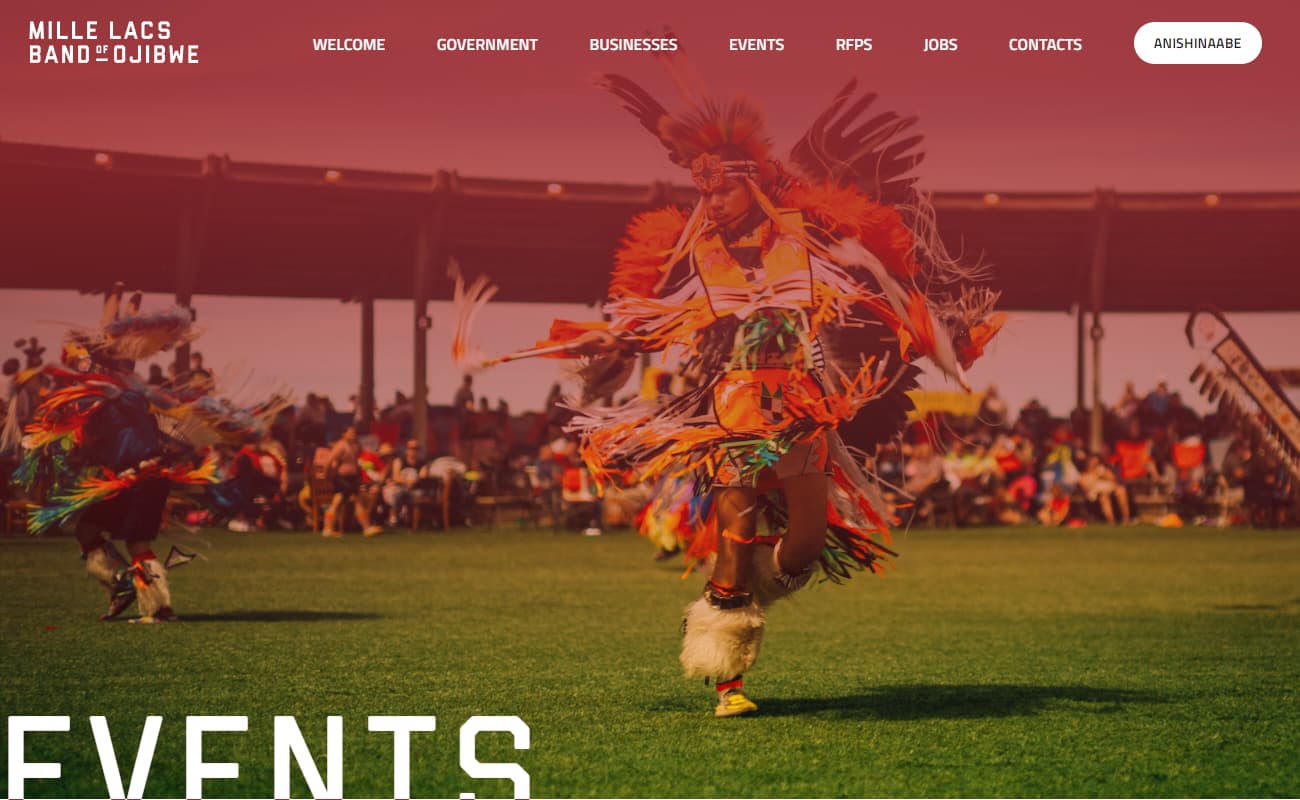
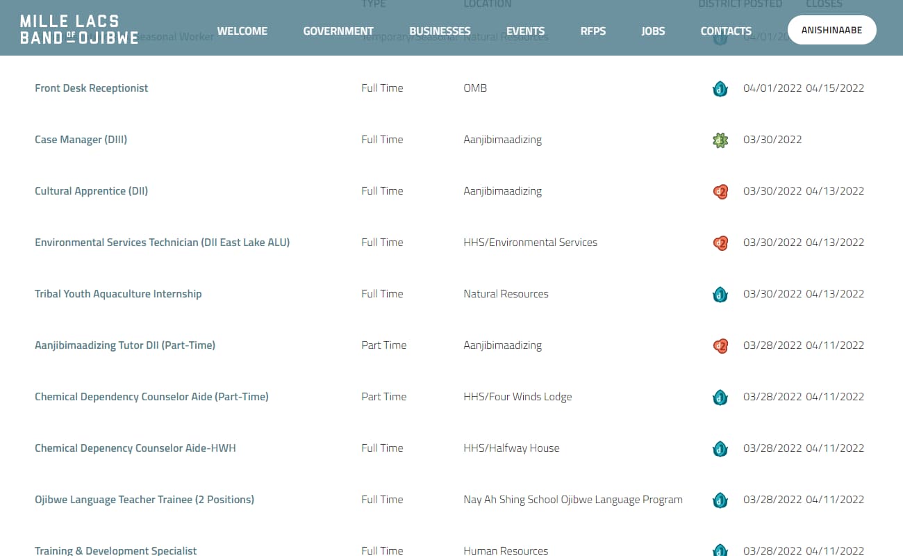
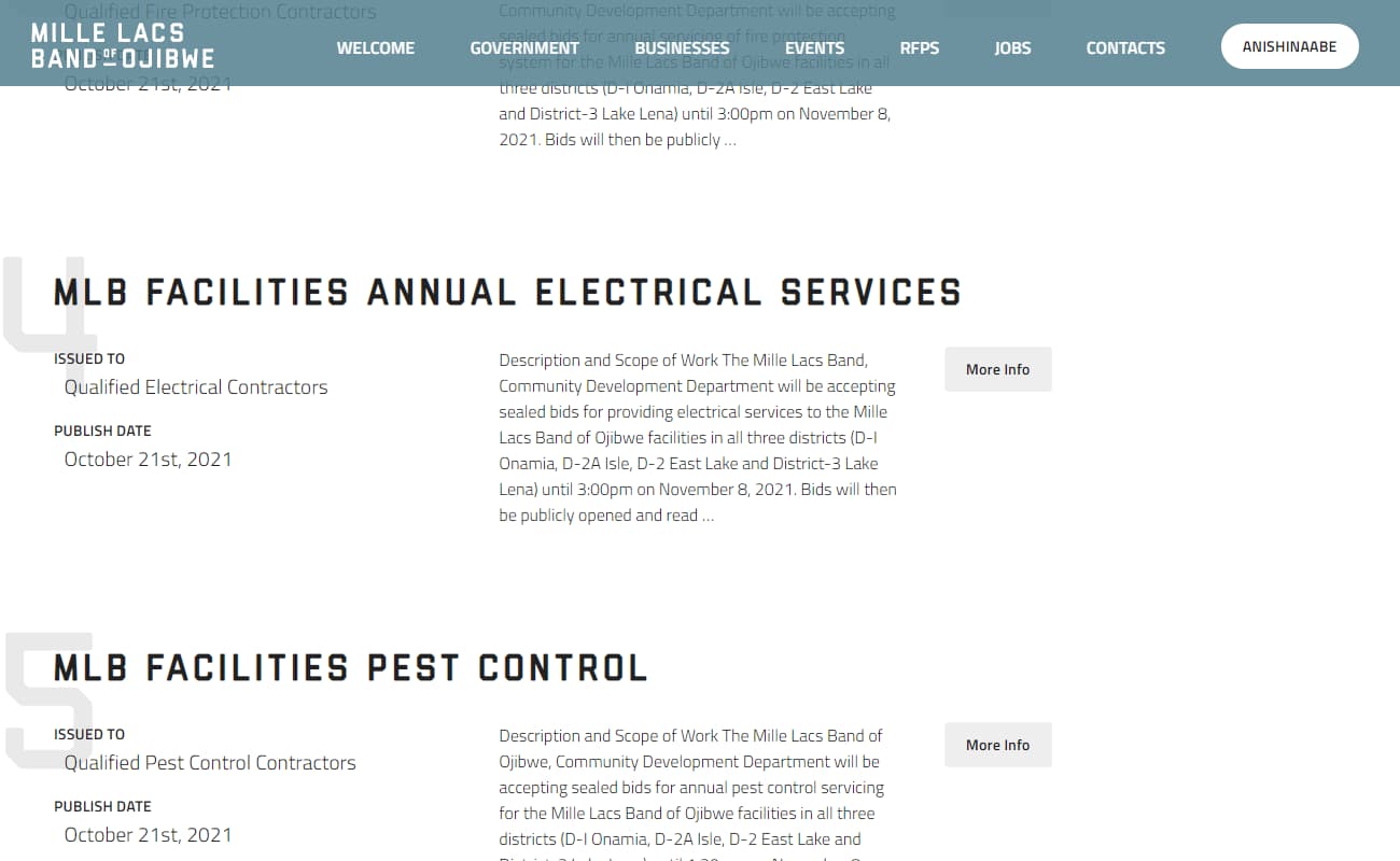
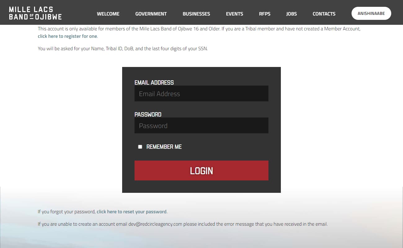
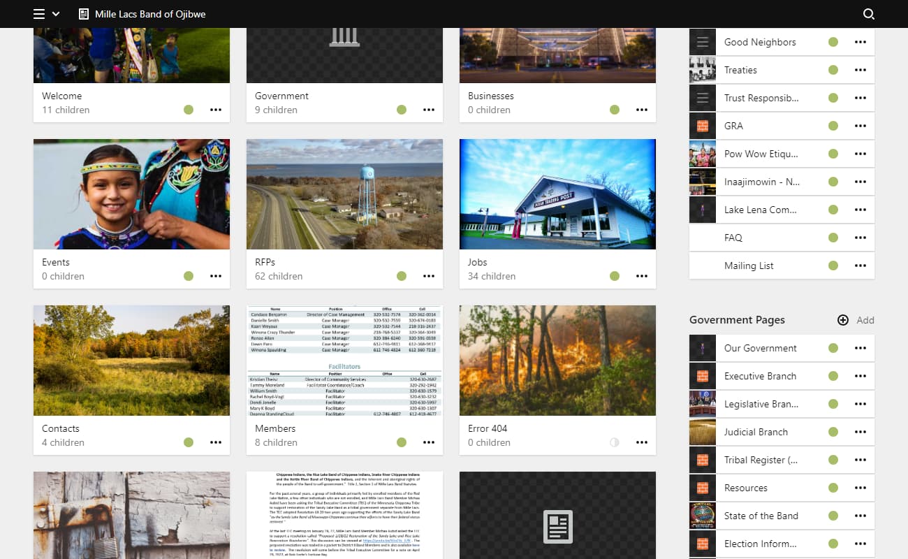
With over 4,000 members, the official website of the Mille Lacs band has a lot of work to do. This is broadly split into two categories...
- Provide information for anyone to learn more about the band, its responsibilities, and it's various offerings (jobs, construction RFPs, medical support, etc.)
- Provide special information to members of the band with names, phone numbers, schedules, minutes of meetings, and other governmental machinations. This was put behind a verification wall.
It's a surprisingly large site with a whole lot of pages, being updated multiple times a day.
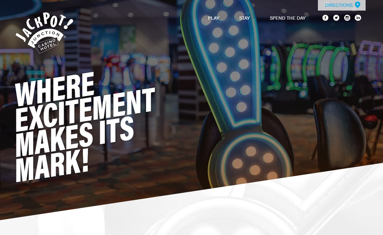
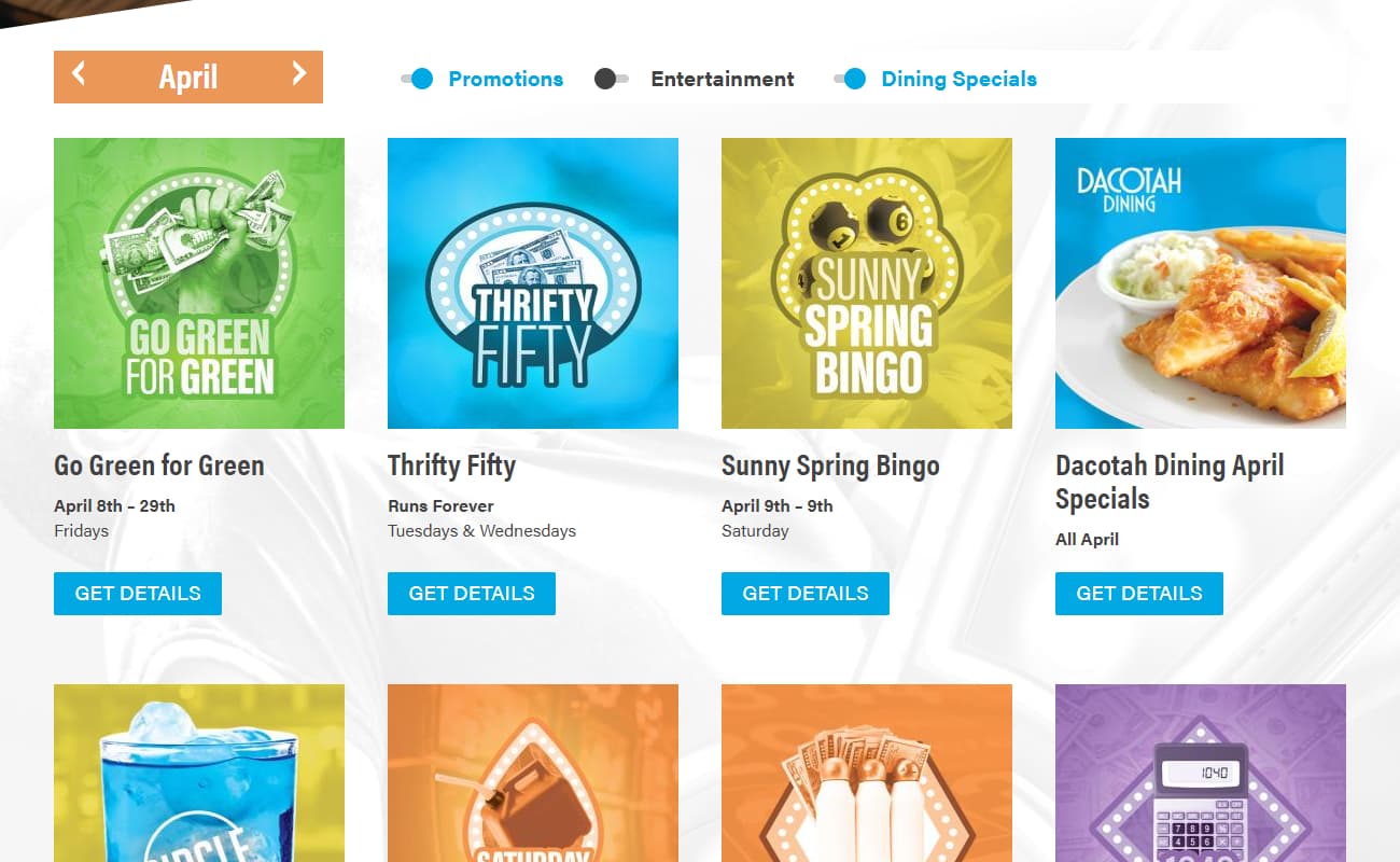
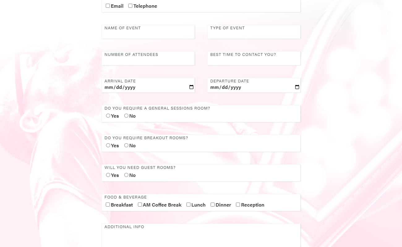
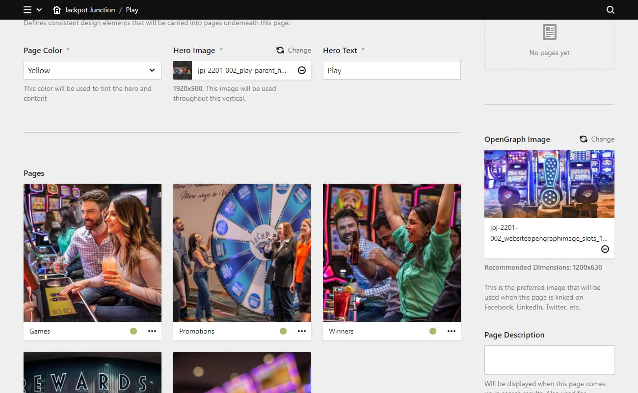
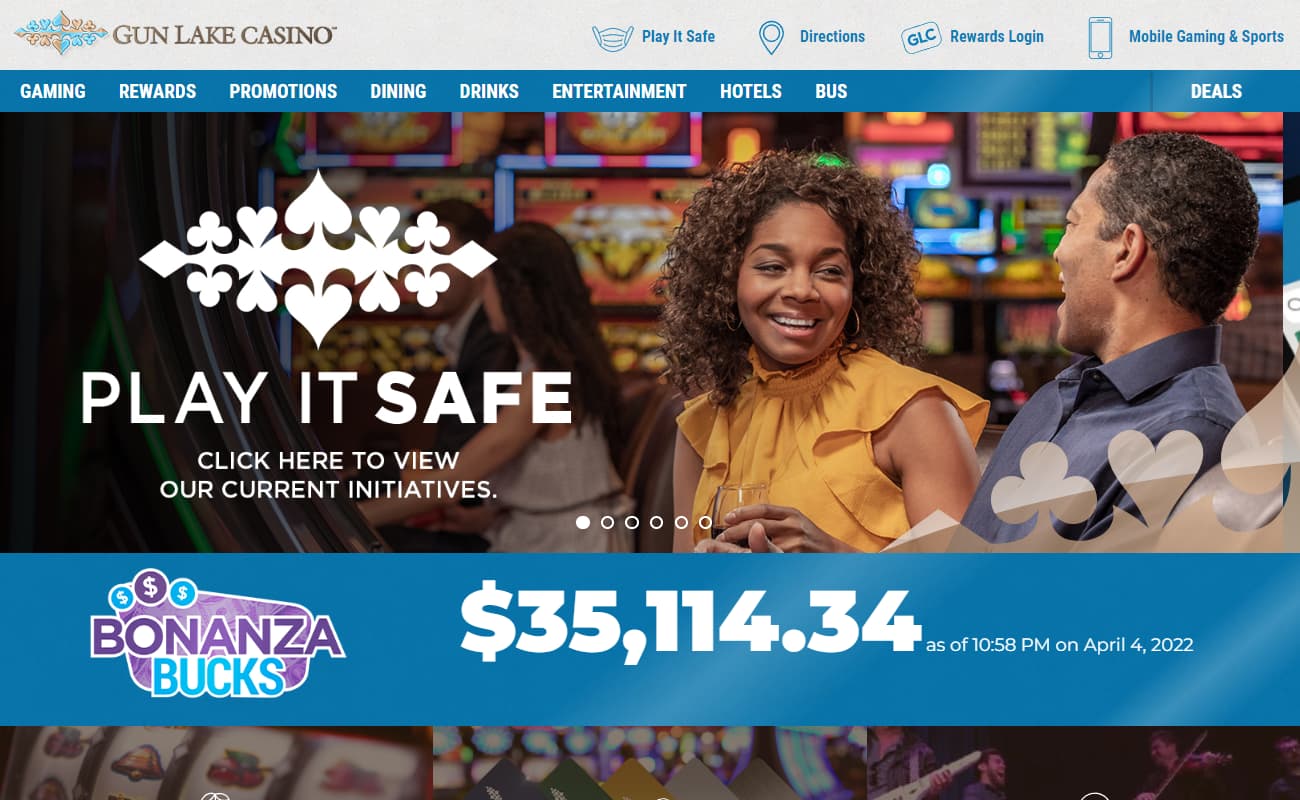
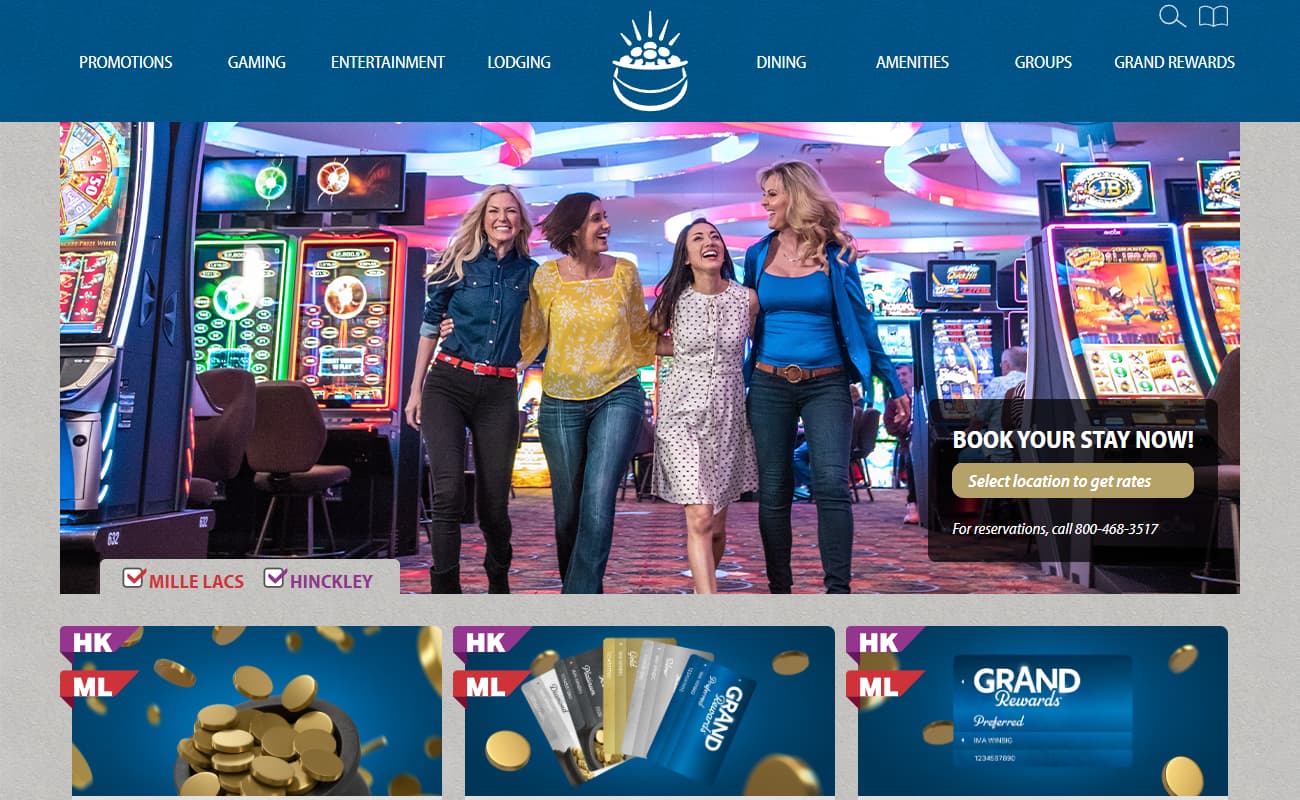
Jackpot Junction's website needed a complete overhaul. Their Joomla-based system was slow, complicated, and difficult for anyone in the company to update.
They were given a build which focuses on timeliness of all their events (promotions, entertainment, dining and hotel specials) and provides a discoverable interface with flexibilty.
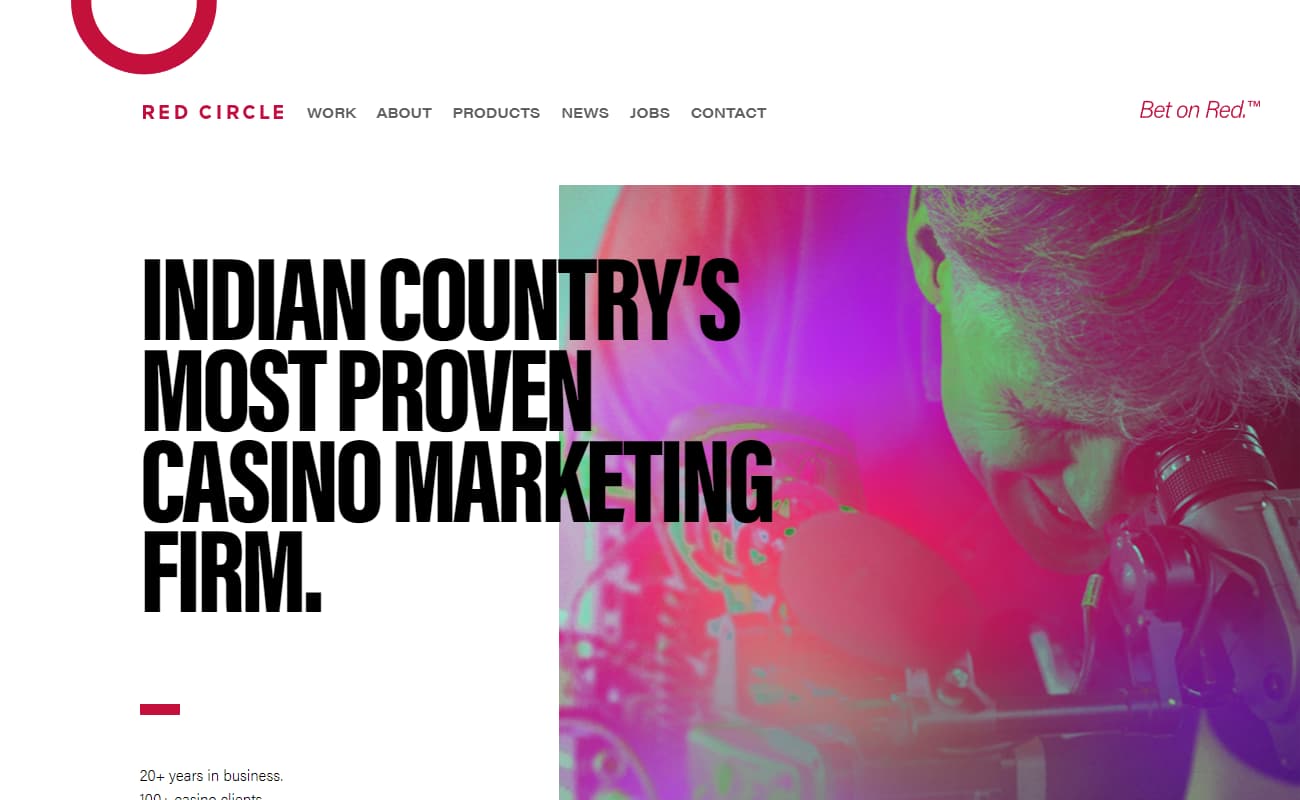
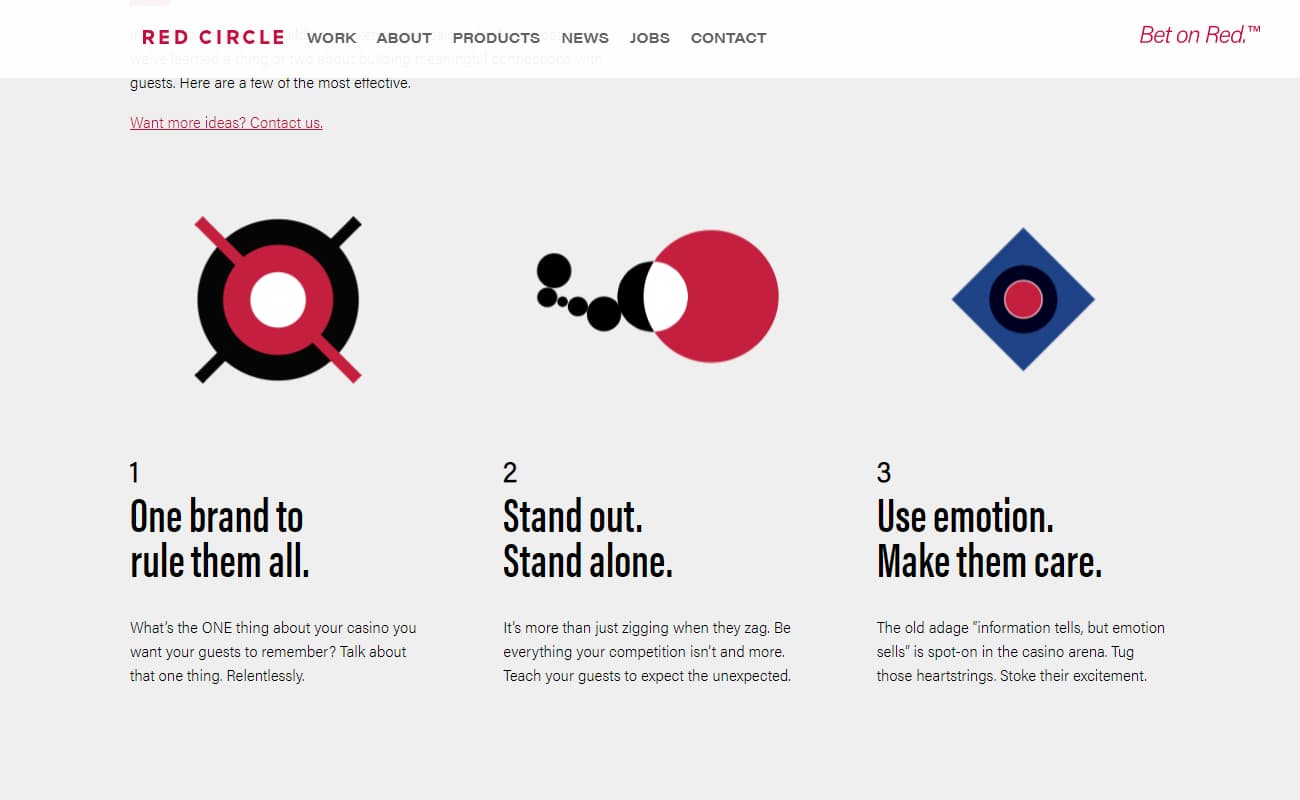
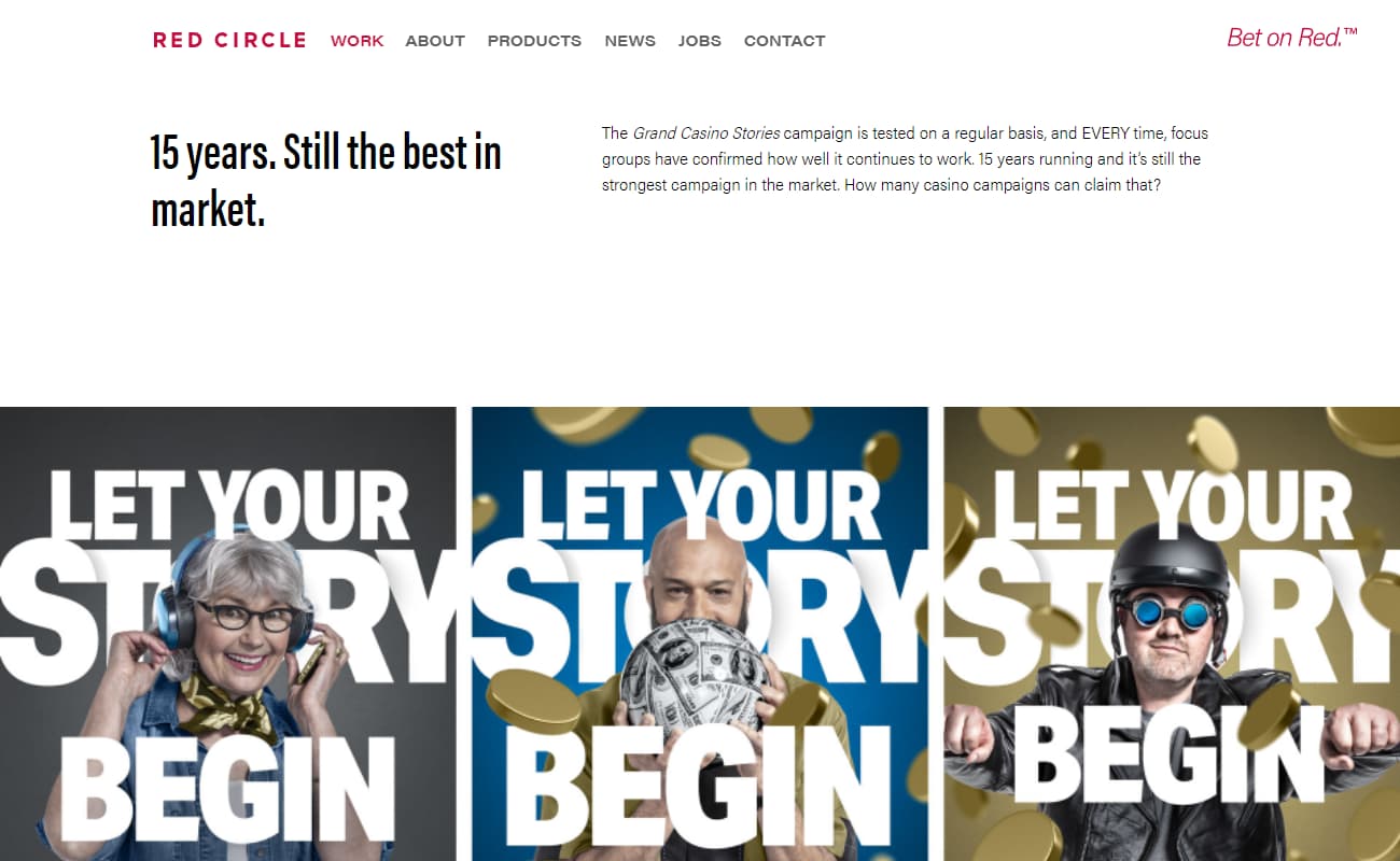
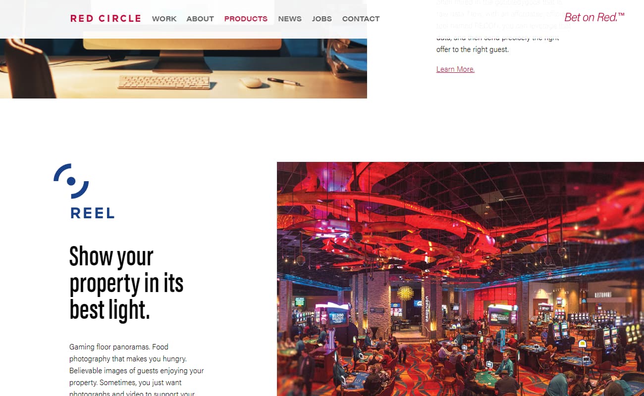
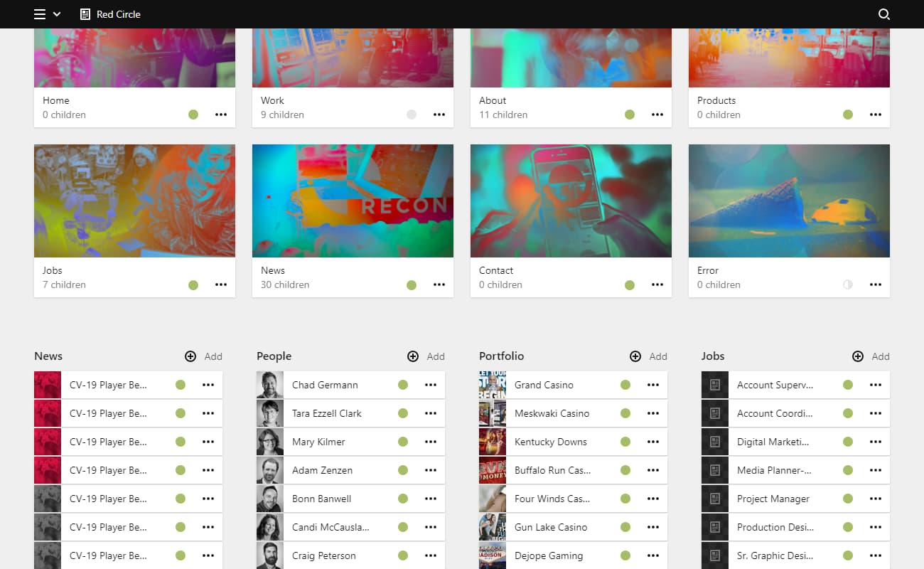
Like any agency website, there's an important mission to show killer creative. Beyond that, the site is meant to show the unique Native American focus that the agency has had for 20+ years.
This website features the work and the mission front and center, as well as the software offerings (which I also had a hand in).
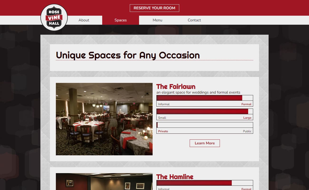
With different configurations for different special event types, and a number of catering options based on client request, Rose Vine Hall needed a site that would show all of its offerings in every possible configuation.
The purpose of this site is to do just that - allowing the customer to visit with their own budget and requirements and find a match for themselves.
Even by voice actor standards, Eric is gifted with a magnificent and distinct vocal signature.
As such, our primary goal was to get prospective clients to experience that voice as quickly and directly as possible, which we solved with a script, scroll timeline, and audio triggers.
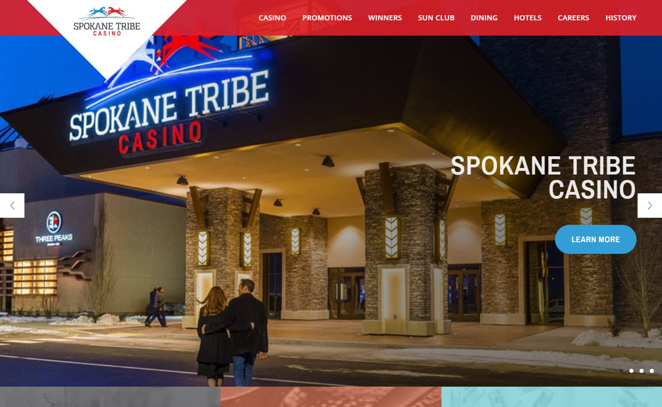
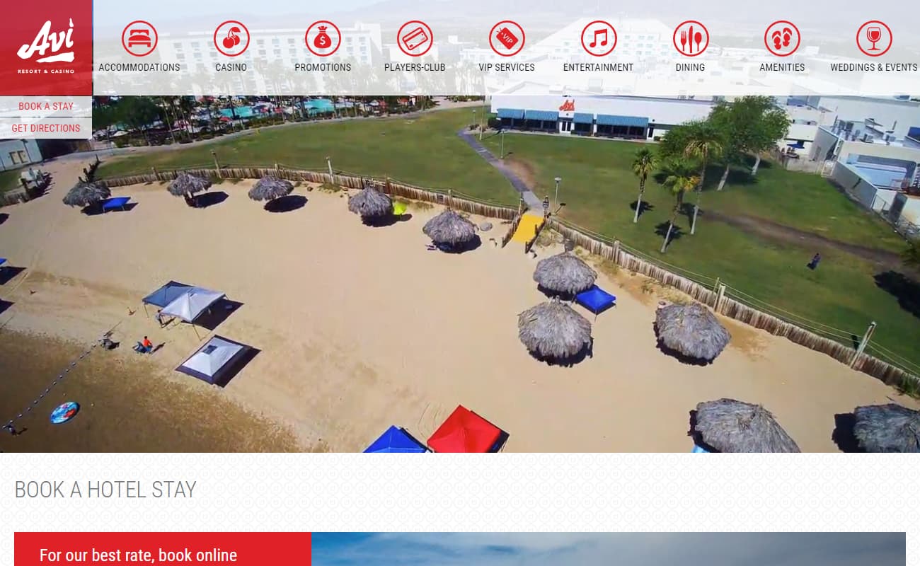
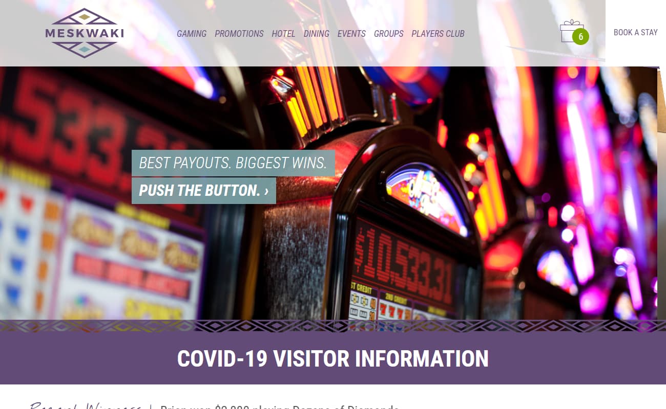
STC was having difficulties straddling two business objectives: Maintaining the loyalty and repeated visits from their existing player base while simultaneously trying to attract new players to try them out for the first time.
What resulted is a website that focuses on imagery: Imagery of the property, imagery of the events, imagery of people having fun - to spread both customer types.
